Güven Optik · 1959

Since 1959, with a new face.
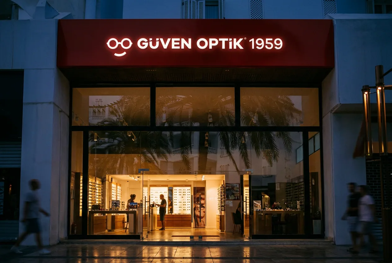
For Güven Optik, in business since 1959, we designed a logo derived from the shape of eyeglasses, the corporate identity, the storefront application and the web interface.
AI-assisted presentation visual
Sixty years in a single line.
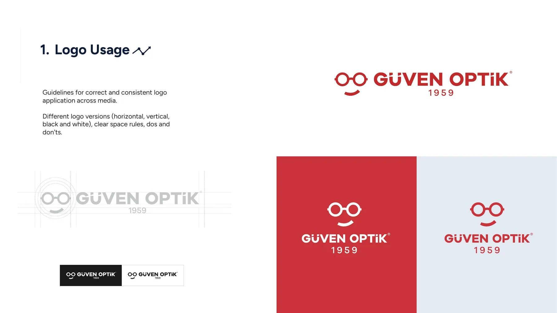
Güven Optik’s strongest asset is its long-standing history. In the logo, we simplified the shape of eyeglasses into two rings and made “1959” part of the brand.
The red-and-white identity reads from a distance on the storefront and becomes a simple, reassuring experience in the web interface.
01
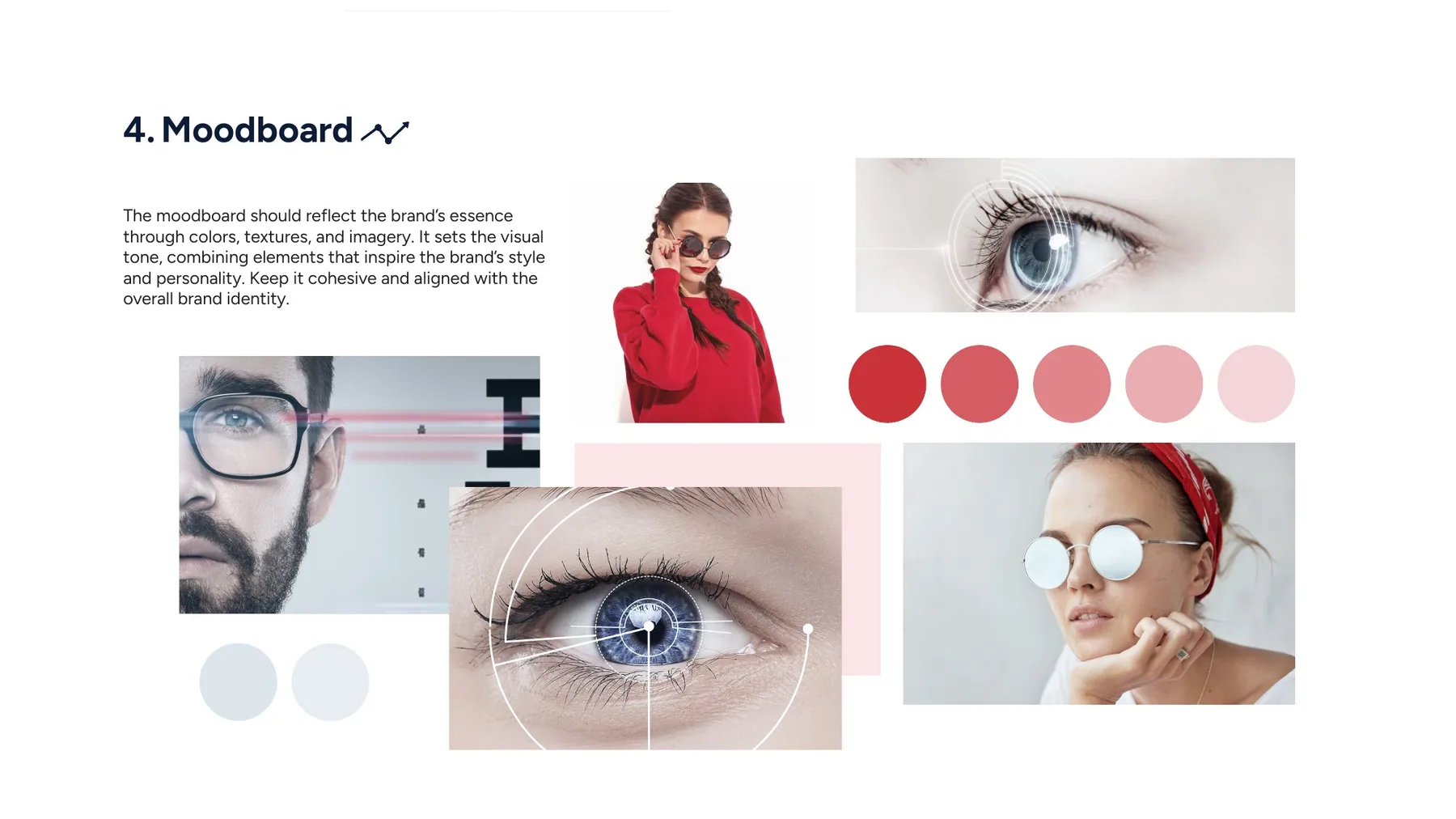
Logo and identity
A logo derived from the shape of eyeglasses, a moodboard and usage guidelines.
02
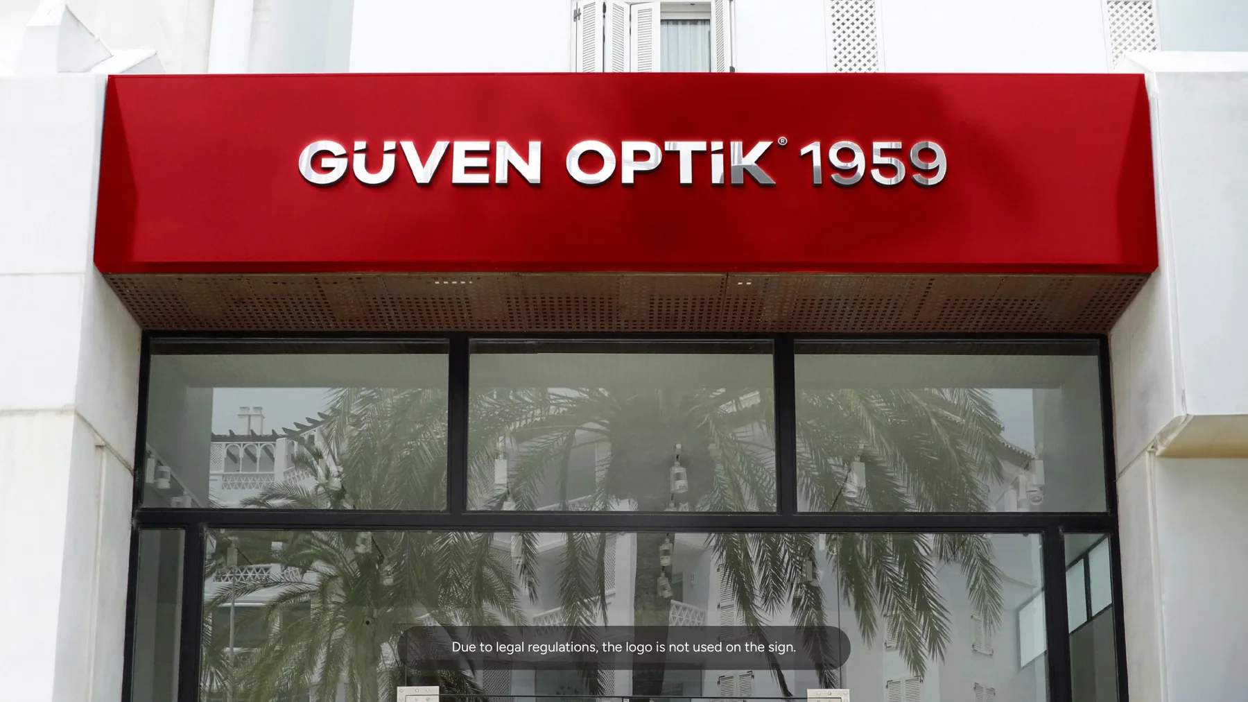
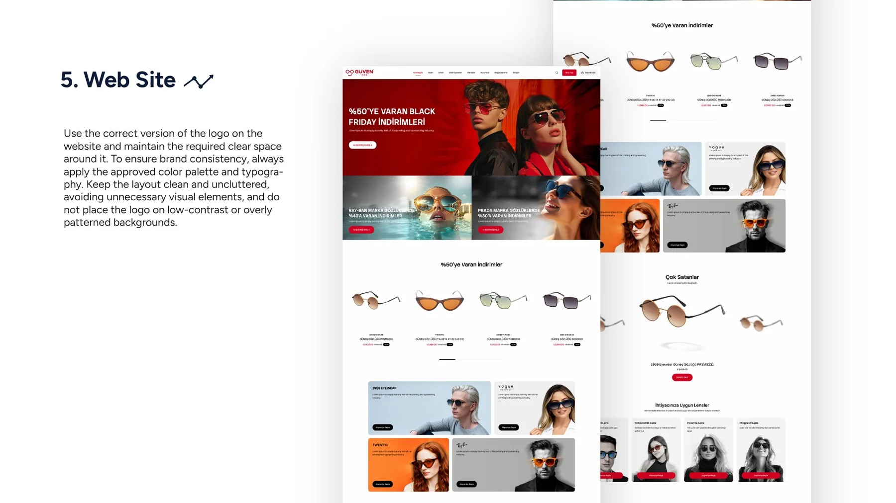
Storefront and web
Storefront application and web interface.
Deliverables
What did we create for this project?
- Logo design
- Corporate identity
- Storefront application
- Web interface design
Make the next project yours.
Tell us what you need — we’ll come back within 24 hours with a tailored quote.